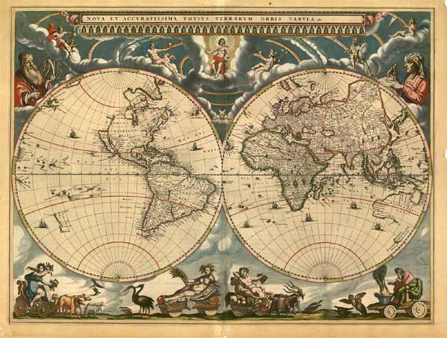
Re-imagining history criss-crossed with geography, in a 100 second time lapse
Wikipedia can prove a valuable source of creating infographics. By allowing information mappers to define a set of given variables, Wikipedia can help extract those data points and graph them in a visual form to re-imagine information.
That is just what London-based software engineer Gareth Lloyd did, and the results are incredibly fascinating. Gareth plotted points from the from the Wikipedia articles that referenced geographical co-ordinates. This gave him a web of links that criss-crossed with major historical events and their respective locations. As Lloyd explains in further detail,
Many Wikipedia articles are tagged with geographic coordinates. Many have references to historic events. Cross referencing these two subsets and plotting them year on year adds up to a dynamic visualization of Wikipedia’s view of world history.
The ‘spotlight’ is an overlay on the video that tries to keep about 90% of the datapoints within the bright area. It takes a moving average of all the latitudes and longitudes over the past 50 or so years and centres on the mean coordinate.
The most interesting thing about this time-lapse is how the history of the world reflects the emergence and evolution of regions across the world, corresponding with their time periods in history. This means that at least until the middle of the first millennium, Asia and Europe completely dominate the graph, and it is interesting to observe the emergence of the American continents and Australia towards the end of the first millennium. At the start of the twentieth century, North America’s influence is clearly visible. It’s an interesting way to imagine the rise and fall of the forces that shaped history, and the places that governed them.
Psst! Our free newsletter offers the greatest and the smartest ideas, essays, books and links in one convenient place. The emails you receive will be short, smart, and always interesting. Sign up here >>


